
Case Study: The Final Stretch Co. “Participant” Ribbon Business Card
01 — The Brief
Final Stretch Co. needed a business card that felt like running culture, not corporate stationery.
The goal: create a leave-behind that captured the emotion of race day, celebrated the running community, and instantly conveyed what the company does—strategic communications for races, running brands, and sponsors.
Rather than another forgettable rectangle, the business card needed to feel tactile, nostalgic, and worth keeping.
How do you design a business card that feels like crossing a finish line?
02 — The Inspiration
The concept was born from the classic Track & Field participation ribbon—the kind many runners remember from school meets and early race days.
(Insert image: Original purple Participant ribbon)
That iconic vertical format, the metallic gold graphics, the zig-zag trim, the small stars—these elements evoke achievement, community, and the simple joy of showing up.
Because Final Stretch Co. celebrates those same values, the participation ribbon became the perfect foundation for a signature business card.
03 — The Idea
A business card you earn — not just receive.
Instead of a card, we created the Final Stretch Co. Participant Ribbon:
a custom, satin-finish ribbon that feels like an award for meaningful collaboration.
Key transformation moments:
“PARTICIPANT” becomes The Final Stretch Company
The generic runner graphic becomes Kat, the brand’s custom mascot
The ribbon’s purpose shifts from Track & Field to Brand & Race Communications

Meet Kat — the FSC Mascot
Kat is inspired by:
Kathrine Switzer, the first woman to run the Boston Marathon
Astroboy and Japanese character design
Felix the Cat, the first animated film icon
She’s energetic, charming, always in motion—an embodiment of the running spirit and Final Stretch Co.’s “finish strong” ethos.
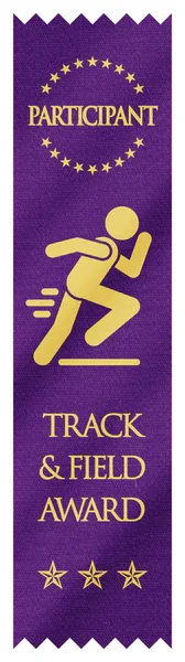
Vintage track and field ribbon.
04 — Typography & Visual System
The ribbon uses a high-contrast type pairing that blends vintage athletic energy with modern clarity:
Groning — for bold, kinetic headers (OLIVIA HOSKIN)
Kinetica — for clean, legible contact details
The star trio at the bottom references classic award ribbons, while the zig-zag trim mirrors traditional fabrication.
The ribbon is printed in FSC’s brand teal with white ink for maximum contrast and readability.
05 — The Process
Archival research: reviewing historical Track & Field ribbons
Character development: designing Kat with a vintage-meets-modern aesthetic
Typography testing: balancing athletic boldness with legibility
Prototyping: adjusting ribbon length, width, and color saturation
Production: satin-finish stock, embossed details, custom die-cut trim
The physical version was produced in small runs for conferences, client mailers, and partnership kits.
06 — The Outcome

Final Stretch Co. “Participant” Ribbon Business Card Design
The FSC Participant Ribbon is more than a business card—it’s a conversation starter.
At events, people keep it, display it, photograph it, and immediately understand the brand personality behind it.
It communicates three things instantly:
We work in running.
We think differently.
We believe showing up matters.
“It only made sense that the Final Stretch Co. business card would be something you get for finishing strong.”
— Olivia Hoskin, Founder
The ribbon now serves as one of the company’s trademark brand touchpoints, bridging nostalgia, sport, and storytelling in a way no standard card ever could.